The Elements and Principles of Design
Introduction
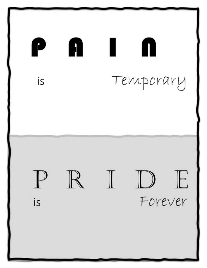
So, you want to learn about design? Before I had learnt about the principles and elements, I didn’t know there were even principles and elements and to me it was just… make it look pretty. But that’s not all that design is. Design is organized. You can be very very creative, but you need to keep certain things in mind i.e., the elements and principles. Let’s start off with a quote about design on a poster which I designed to introduce what design is (what a mouthful).

CRAP!
- C: Contrast
- R: Repetition
- A: Alignment
- P: Proximity
In that poster, there’s definitely a lot going on. Looking at it now, I wouldn’t call it a very good example, but we can dissect it using CRAP. The four main design elements and principles I learnt this year.
Contrast is anything that as the name tells contrasts in the design. Contrast is used purposefully to highlight certain aspects. Text fonts can contrast, text size can too, and colours can also be used to show contrast. In general, contrast can be good, but too much can be destructive. In the poster, a lot of things contrast to emphasize certain words and it’s the reason it looks like there’s so much going on.
- The word “disastrous” is a completely different colour because it’s a keyword.
- Design is not only a different font but it’s also slightly tinted because it’s another keyword.
- There are varying text sizes in the poster and keywords are bigger to show importance.
Repetition is like the opposite of contrast. In design there needs to be repetition so the piece actually looks cohesive and whole. Repetition is consistency. It organizes information and unifies a work. Repetition on this website is the “Chinanuokum’s blog” header across all the pages. You can repeat colours even though they might contrast by creating a colour scheme. In the poster, the colour grey is repeated and different text fonts are too.
Alignment is lowkey slept on, but it’s quite important. Imagine if this entire website was center-aligned, or if the text indented at random places. It would be so recognizably upsetting to look at. Alignment makes a design look clean and sophisticated. And like repetition, it creates unity. Examples of alignment are center alignment and left/right. Center is said to be cliché, formal and ordinary. While left/right depicts edginess and should be done more. The poster is center aligned, but it was deliberate because I don’t think a left/right alignment would have looked very appealing. Most posters are center aligned.
Proximity involves grouping related items together. Not much to say about that. The poster doesn’t have a good representation of proximity, so let’s introduce this new example from BuiltIn.com.
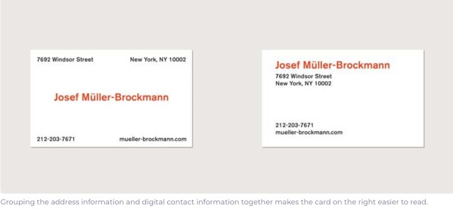
Proximity has a lot to do with layout. As the caption indicates, grouping those related items together makes the card on the right easier to read.
Now, after learning about these major design elements and principles, try to identify them in the example below. What are some aspects of the poster that could’ve been improved? How did contrast play in with colours and text? What is the alignment of the text? Is there repetition? And are any similar items grouped? Next, try to apply them to your own work!